Flowers 55
48" x 36" Acrylic on canvas
$3,000
Flowers 55
48" x 36" Acrylic on canvas
Flowers 55
48" x 36" Acrylic on canvas
Flowers 25
20" x 24" Acrylic on canvas
$2,000
$3,000
$3,000
Flowers 25
20" x 24" Acrylic on canvas
$2,000
Flowers 25
20" x 24" Acrylic on canvas
$2,000
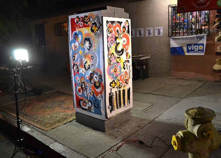

Flowers 70
20' x 16' Acrylic on brick
Mt. Washington, CA
Flowers 70
20' x 16' Acrylic on brick
Mt. Washington, CA
Flowers 70
20' x 16' Acrylic on brick
Mt. Washington, CA
Flowers 70
20' x 16' Acrylic on brick
Mt. Washington, CA
Flowers 70
20' x 16' Acrylic on brick
Mt. Washington, CA

Bio
Todd began doodling as a child, urged by his parents to draw instead of watching TV, and his earliest influence – the pop art of the 60’s – has remained with him today as an inspiration. Flower-Power advertising, Peter Max, and Andy Warhol all made a lasting impact on the young artist. Growing up in the Midwest in the 60’s and 70’s definitely left a lasting imprint on Todd’s design aesthetic, with its odd color combinations and retro hippie-graphics.
In 2013 Todd started painting and would often paint with his two young daughters. The girls would mix their own rich colors, paint for a while, and then lose interest. Instead of pouring the paint down the drain, Dad would pull out a piece of butcher paper and do his thing - the flower doodle.
With the deft utilization of simple forms, he is able to create portraits, houses, scenics, full-figure nudes, vases on tables and abstracts. The repetitive rounded curves and flowing circles have a familiar sensuality that most people, consciously or not, find appealing and comforting. His paintings and murals all share the same joyous iconographic doodles of his youth, thereby fulfilling his desire to bring a bit more joy into the world. Todd is currently a resident of the famous Brewery Arts Colony in Los Angeles, CA.
Artist Statement
I think that art exists to make us feel something. That’s why we’re all here. To experience stuff. Feel things. Express ourselves. Art acts as a spring board for that. I feel compelled to create, and try to paint every day, as I have had this feeling my whole life. I truly feel that it is my mission on the planet - to make beauty, spread joy.
The flowers I paint are more than a flower. It is an emblem almost, a bit of a nod to the past for those of a certain age, a subtle reminder or memory of a free-spirited time in history, reworked and revamped to invoke a mood through what has become my signature lyrical style. I use a somewhat muted color palette, often leaning towards the unusual tones popularized in the 70s. Avocado green, burnt orange, mustard, teal, warm browns...I suppose it is somewhat a post-modern palette, yet it seems to go with any kind of décor in any location.
I use acrylic paint, it dries quickly, and allows me to layer colors easily. I usually start a painting with a rough idea, a composition in mind, a limited pallet. But, at some point the painting takes over, and shows it has a mind and soul of its own. It becomes subconscious, forms flowing, happy accidents stumbling one onto another, organically creating the perfect outcome. The brush strokes create so much more than a flower – it brings to life the visual expression of what is inside of me, and stimulates positive reactions in viewers as well, bringing out their happiness and love of life.
My work does not have any political or socio-economic message. It isn’t trying to make any kind of statement, and is not affected by the news or current events. It is a celebration of life, as flowers are a symbol of renewal and regrowth, a place of retreat, something that makes people happy. Enjoy life. That’s the message.